AIGA Data Visualization
For this project, we were given the task of visualizing the data found in the 2018 AIGA census. Through analyzing trends and finding relationships, we were able to attach visuals that presented our findings in an interactive manner. This project focused on exploring methods of visualizing information and finding ways to use data beyond the purpose of simply delivering information.
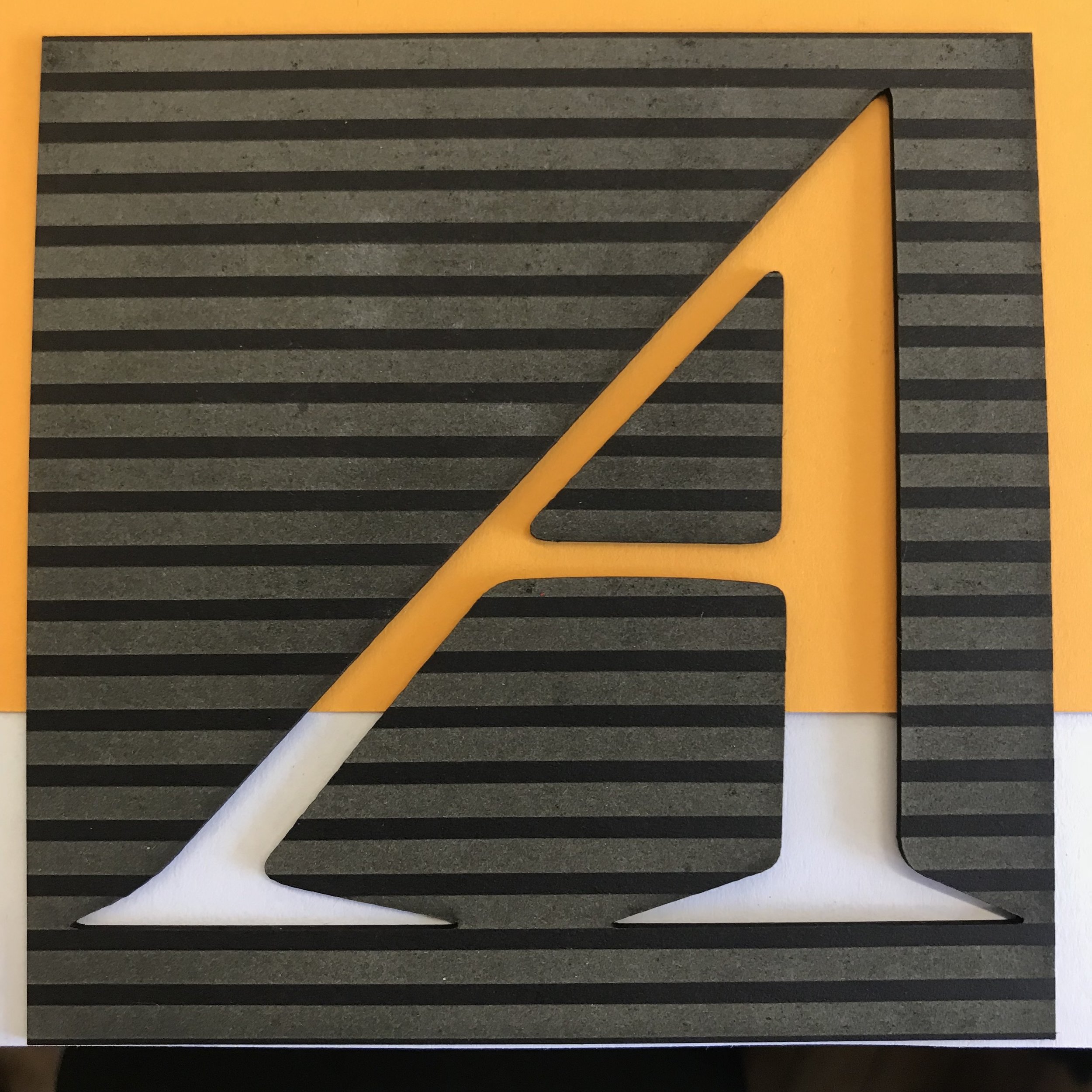
We decided to directly manipulate the AIGA logo to correlate with the data based on location, and in our case specification of education. We went with a physical product for many reasons including the affordance of actually feeling the logo and based on orientation the data visualized will change. Although digital 3D models are possible, the materiality of the board and the laser cut elements in the line-weight allow for another level of interaction with the user that we wanted to address.
In early 2023, I came back to this project to re-think the app UI.
Initial UI concept from 2018
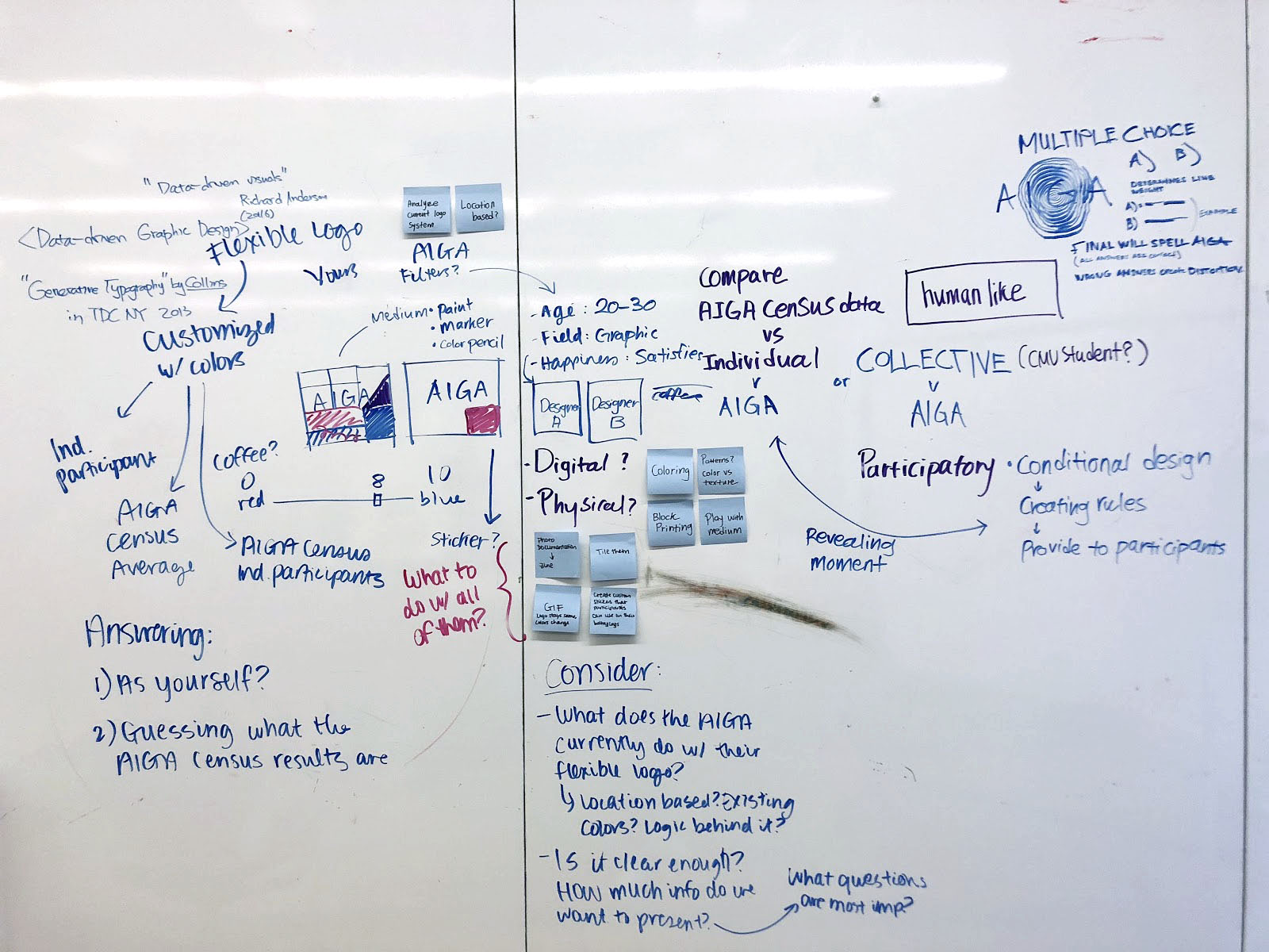
Our process began with collaborative ideation. Throughout of project our ideas and concepts changed for the better, we never completely committed to an idea till the end which gave us leniency and elasticity to make changes for the better
After getting all of our ideas out, we decide on recreating the AIGA logo in relation their census.
To do this we divided each letter of AIGA and assigned a specific trait to each. These ended up being Satisfaction, Education, well-roundedness and Stability.
Our design took the form of a square to create a grid that could be compared to other logos at the end
Satisfaction
Well Roundedness
Stability
Education
We decided to use the data to find out more about certain qualities of a designer. By using multi-variable analysis of select questions in relation to one topic, we were able to determine through percentage, how satisfied, stable, well rounded, and educated a designer was based on their answers.
After we manually generated this data and graphed them, we wanted to take this a bit further and get the perspective of our peers in this project. We devised a questionnaire with questions directly related to the one we used for our data analysis and asked each school what their answer would be. The questions where tailored to students. Through their responses, we could compare their answers to our findings from the data and determine percentages in each category and the subjects as a whole.
Above are our findings based on each category. By finding each percentage we can know which answers correlate with the subject it is under.
During this time we were also playing with different color options and choosing which fit the best for AIGA. We eventually chose a singular color for each letter to reduce the busyness visually.
Once all of our data was collected we needed to assign physical features to each part of the data. We assigned the features based on if the answers ranged from yes or no questions or on a scale. from there we came up with variations for each letter so that we get some diversity in form. From there we made a key and proceeded to make the physical logos
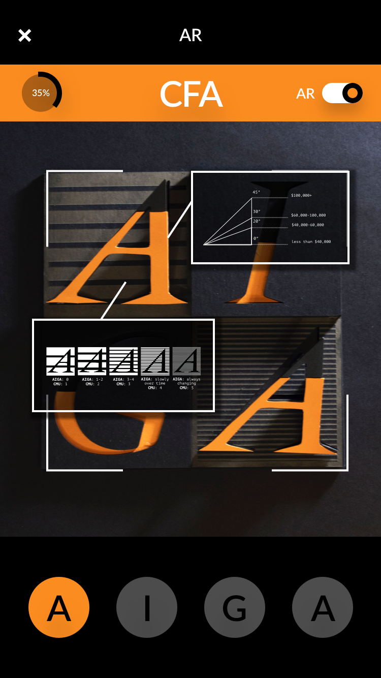
The above posters are a visual for the user to understand what they are seeing before they interact with the subjects. Below shows what each element means for CFA’s specific logo, if you were to connect the key to the visuals
Below is an example of one of the school’s logo. Each block has questions with answers from that school that relate to the physical form. The percentage next to the letter and subject indicate the whole of the colleges sense of that subject.
MOBILE APP
To further help the user understand the data, we devised an app that has built in our logos as QR codes to show how each element relates to. The app will use the camera to identify which logo out of the 9 you are trying to identify, and then bring up the information. The information will point to the specific feature that it’s referring to and tell you about the college’s/ cities answers and how that relates to the AIGA census. This element can take over the physical print piece if one is more inclined using their phone. It brings another layer of interaction that will appeal to the user. The user will find it easier to find the information and therefor be more inclined to explore the information gathered by AIGA
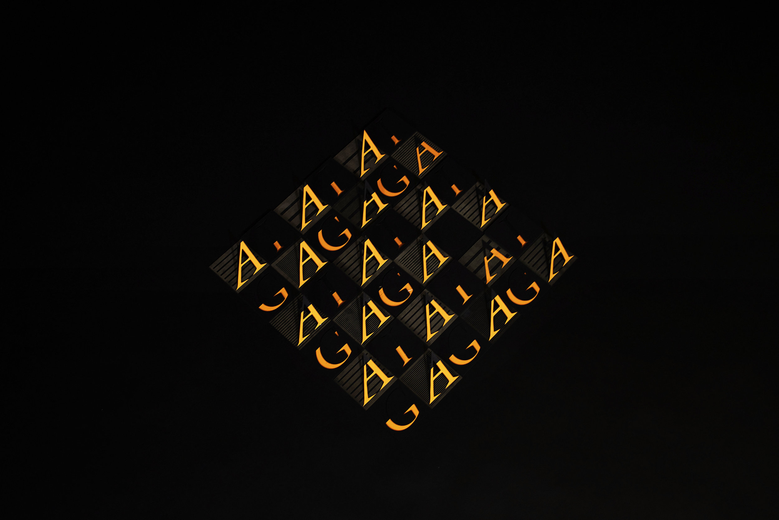
on display at Miller Institute for Contemporary Art


